A Brand Identity That’s Spot On
Impact Business Coaches
Goal
Impact Coaching needed a brand refresh and brought in to design a new Brand Identity and the necessary collateral to promote the brand in an effective and consistent manner.
Our Idea
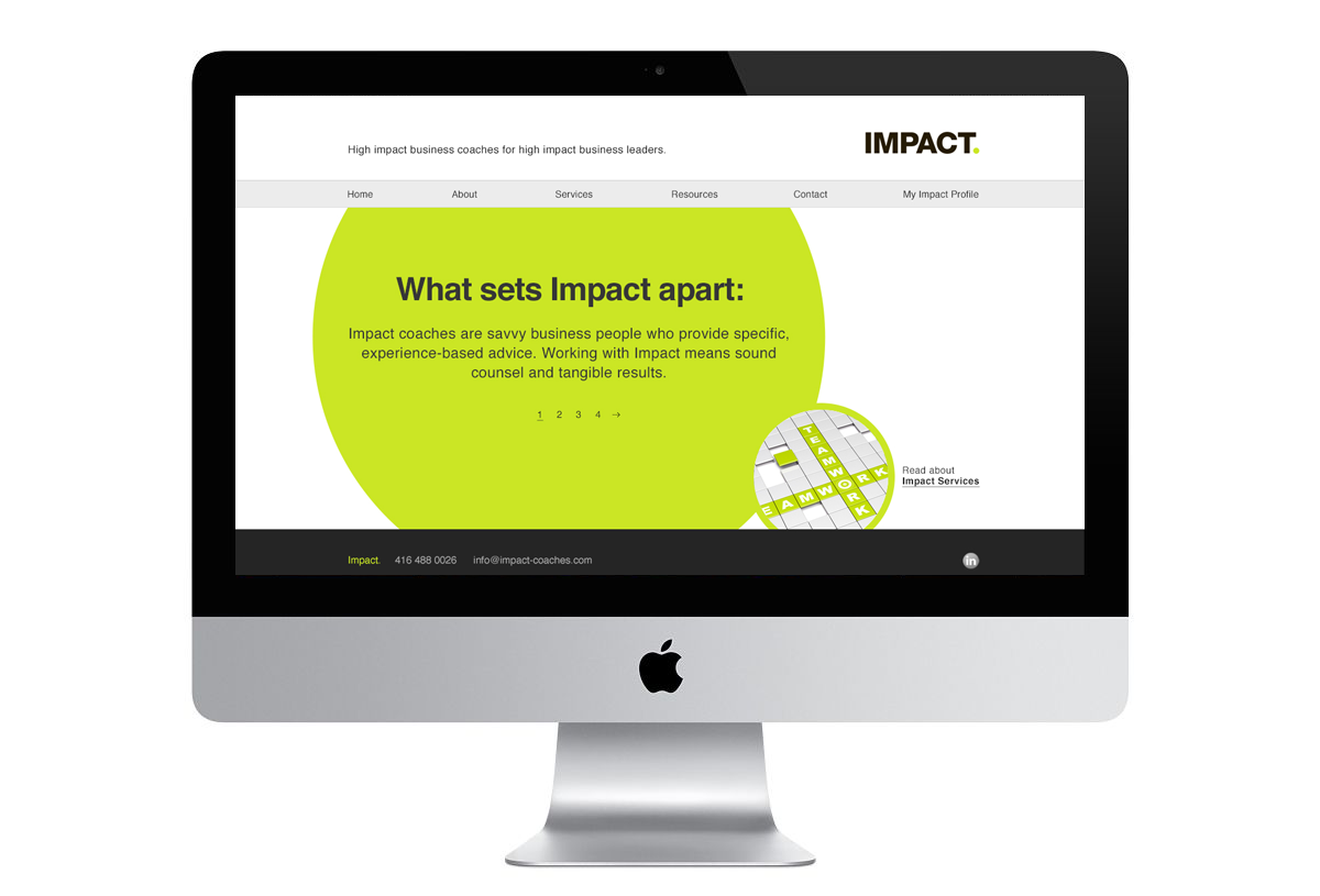
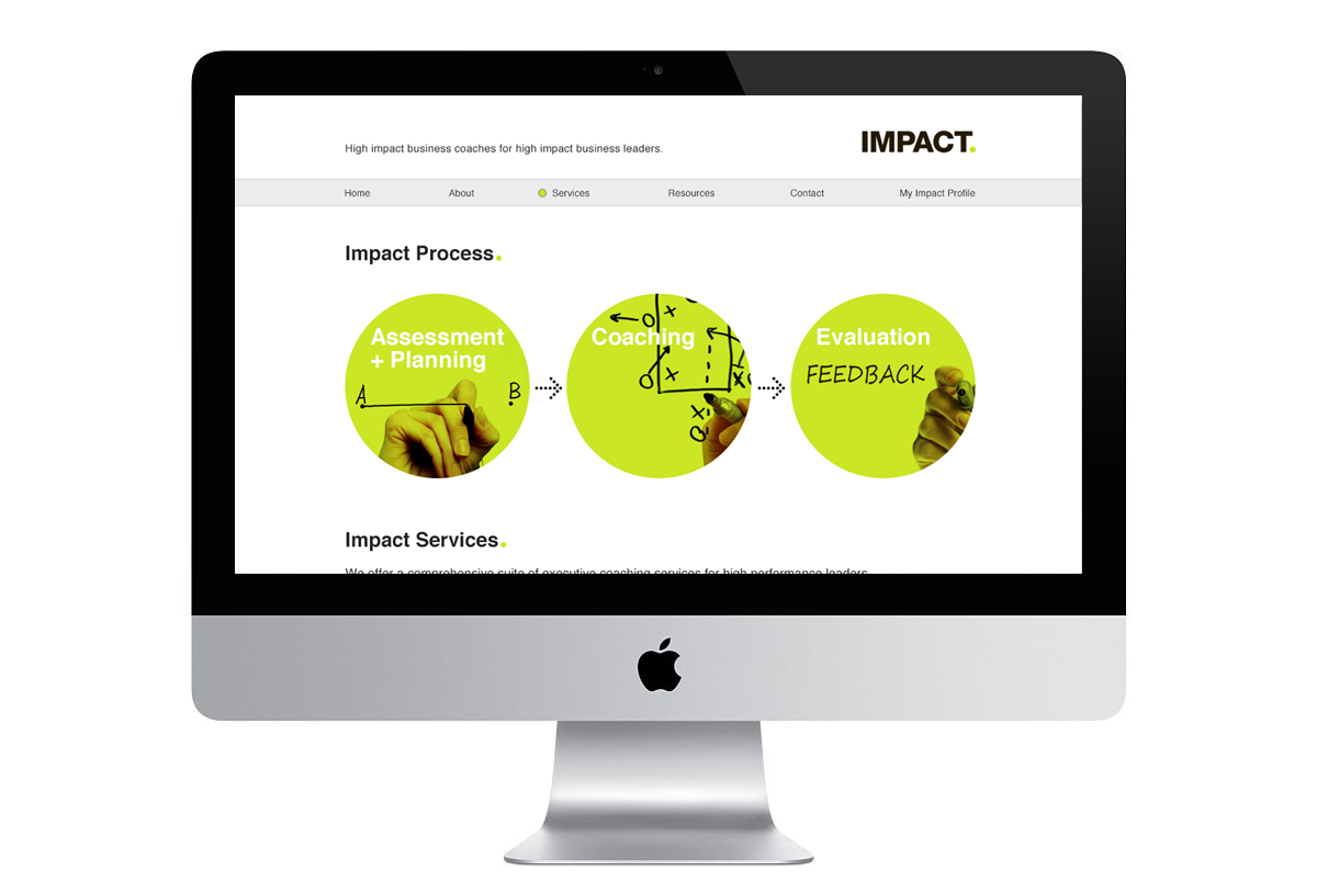
Our idea was that businesses really start to perform once they have the guidance and support of a team of coaches. The logo and identity reflects this idea—the period after the word “Impact” mimics a green light. The green dot then became an icon throughout their communications. The business cards were diecut (hole-punched) where the green dot was.
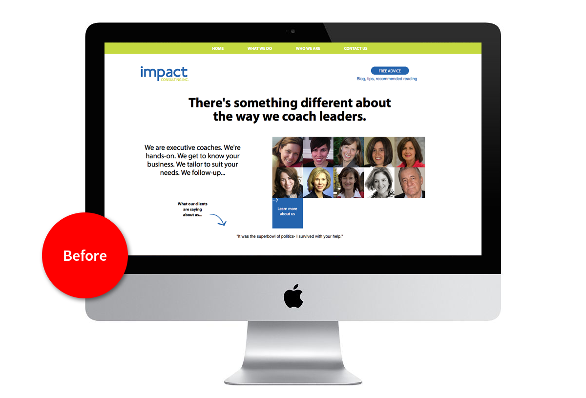
The result is a fresh identity that is simple, memorable and timeless. We also art-directed the portrait photography of the staff to ensure a cohesive look and feel, which was missing on the previous website.
Deliverables
Logo Design
Brand Identity Design
Website Design
Custom Portrait Photography


